When I was in college, I once wrote a short story entirely in crayon. This was most likely because I was bored, but there was a story reason for the choice that I can’t recall (just as I can’t recall what the story itself was about, and I lack sufficient energy and motivation to dig it out of my files to find out), some sort of color theme. It’s one of the few times in my career I’ve tried to play around with the presentation of a story as opposed to relying on the words themselves to carry whatever message I’m trying to convey. Although I do have certain private peccadillos (only writing short stories in longhand, only using a blue pen) when it comes to publishing my work I don’t like to rely on font or design choices to carry anything, because those can be lost or misinterpreted. When the superadvanced roach species that rules this planet in the future finds my work (and they will), I don’t want half the point lost because they don’t have Comic Sans loaded on their futuristic devices.
It’s Not a Rule, Though
I’m currently reading a novel that does rely on a lot of design work and special fonts, and it’s not working for me. For one thing, the special fonts are distracting; one is meant to resemble handwriting, but the perfect repetition of the letter forms betrays it and spikes me out of the narrative. For another, the special, heavily-designed sections meant to resemble specific modes of writing, time periods, and other aspects of the story are just kind of useless.
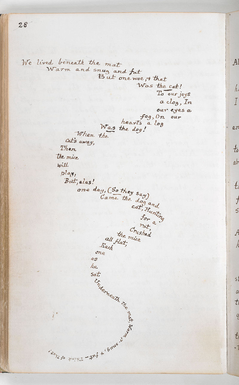
Your mileage may vary, of course; anything can be pulled off in a novel or story, it just requires that you have the talent and vision to do so. For example, I love House of Leaves despite (or perhaps because of) it’s use of font shenanigans and specific design choices. And would I love Carroll’s The Mouse’s Tail—which I named my blog after!—if it wasn’t so meticulously laid out?
Still, for myself, I’m a purist. I’d like to think I can convey anything I need to simply through my control of the language. And I kind of feel like that’s definitely where you should start, even if you do end up utilizing some font shenanigans or other design wankery to get a certain effect. All of your work should be design-indifferent, utlimately, in my opinion, with the frills added on later. I stick with italics for anything that’s not part of the main narrative, and if you’re confused after reading one of my stories, then it’s not the fault of the design or the font choices, but rather of my writing.
But then, what do I know? Depends who you ask. The Duchess will tell you I have some knowledge of housekeeping, but not much else. And she will go on at length on this subject, too, so clear some time.